Website Navigation on a Small Screen
 I’ve got a Mini which I enjoy driving. But the little icons on the controls still confuse me. I can never remember which to press for the heated screen or demisting or whatever. It would be so much easier if they had a little label I could read. And if that’s not possible, it would be great if all cars used that same standard set of icons for the plethora of buttons, knobs and other controls that litter my dashboard.
The same argument should apply to remote controls, toasters, microwaves and websites.
When I visit a website what matters to me is the ease with which I can access the information I need and take what ever action is required (such as fill in a form, order a product or download something).
One of the primary routes to the information I need is the site navigation (aka the menu).
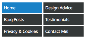
On a desktop or tablet I expect this to be a row of links across the page just below the logo. I also expect the links to have meaningful captions. Unlike this:

All well and good but an awful lot of browsing is now done using devices with smaller screens and the traditional menu bar is often too wide for the screen.
 The lazy developer will simply use the hamburger menu option (a three line icon up in the top corner). It’s a simple and practical solution from a developer’s point of view but hopeless for the poor user who often doesn’t even know what the icon means.
A much more elegant solution is to rethink your whole navigation. If you can reduce the number of links (shouldn’t be more than 6 anyway) and fiddle with the styling a bit you will be able to display them all on a small screen.
If you really can’t reduce it down then don’t use a little icon in the corner, put a big obvious button on the page.

There isn’t going to be one solution for all, every site is different and will need different navigation options. But here’s the results of some of the testing that has taken place on small screen:
1. The preferred option is to display the full menu if you can get it to fit on one line (like on this site).
2. If they don’t all fit on one line try restyling the links (which is what I did).
3. If you can’t restyle try using a ‘menu’ button that opens up a menu when touched (here for example).
4. If an icon is the only option then add the word menu and give it a border.
Here’s some further reading:
exisweb.net AB split test, take time to really read the report
lmjabreu.com Strange styling but good data
peakusability.com.au A good usability test.
webdesignerdepot.com An example of the complete bollox designers speak to justify poor usability
nngroup.com Note the date of the article…
Cool post. I just assumed people new, but did a test and showed him two phones with my website on each, hamburger icon on one and ‘menu’ text on other, he of course could find the menu on the phone that had ‘menu’ on it but when I asked him where the menu was with the hamburger icon he couldnt find it so pretty cool knowing that. Also that business zone website is shocking, I thought when I would click on the menu I would understand what it meant but I was just baffled.