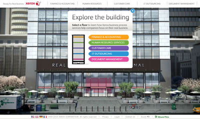
Xerox Real Business – a website that truly sucks
A short post this one because all that needs to be said is embraced by a truly awful website.
One would have hoped that a large multinational company would know better. But they don’t. So three cheers for the xerox real business website (if you can be bother for the thing to load).
If you have got speakers the experience is even better. Not.
I have no doubt the marketeers and designers and corporate suits are all slapping each other on the back and saying how great it is. Sigh…

Xerox have updated their site since your posting. However it is it still (IMHO) poorly designed and hard to navigate.
Keeping to the simple rule for menu bar navigation maybe boring to some web designers who love to experiment with new designs, but if the result is difficult for the end user to find what they are looking for then it’s a big no-no.
I’m a web designer myself and I love letting my creative juices flow. But it needs to be kept in perspective.